Front cover:
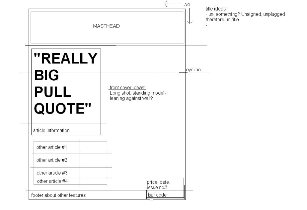
When thinking about the genre of music magazine I want to create, I imagine the style and layout of the magazine to make a statement, especially on the front cover - to catch the reader's attention and set it apart from the other magazines. My questionnaire results found that this is what potential readers want and are attracted to so I hope that my large, statement headers will do so. As the layout of my front cover is left aligned, I plan to take photos that are mainly right-aligned to create balance. As you can see written on my plan, my initial idea was to have the model leaning against a wall or tree which could create a laid-back or 'edgy' image of the artist depending on how I frame, manipulate or angle the shot.
I plan to have the masthead in a very distinctive font to create a recognisable style for the magazine and to have the main header, the pull quote, in a very bold and heavy sans serif font to create as much impact as possible. Other fonts, in the subtitles/date/issue number, will be a different sans serif font to create variety whilst still making sure that all the text is easily readable.
Contents page:

For the contents page, I want to have a variation of fonts - bold, impactful ones for headers and easy-to-read sans-serif ones for the smaller texts. The header fonts I decide to use should reflect the attitudes and values of this publication as this is what will draw the eye and give a first impression of the magazine.
Double page spread:
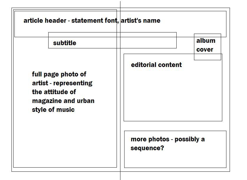
Here is my initial house style plan, which I feel represents the target reader's attitude and expectations of this type of magazine:

- I chose the fonts because they have an 'edgy' style that sets them apart from other magazines- I learnt through my questionnaire that readers want this
- I added courier and arial because there needs to be an easy-to-read font for the main text to make accessible to the reader.
- In terms of the colour scheme, I thought that the bright colours would create a striking effect against the black and white so would again appeal to the wants of the audience for its design to stand out against other magazines.
No comments:
Post a Comment