Contextual research
Front covers:
These two front covers are from similar publications to what I want my own to be. They have differing focuses and audiences, but their style and attitude are what I wish to create.
Genrally, it can be said that Q focus much more on mainstream music and NME on alternative like my own, but Q is still relevant through it's heavier concentration on the music than other magazines, a feature which my questionnaire showed I needed to include in my own work.
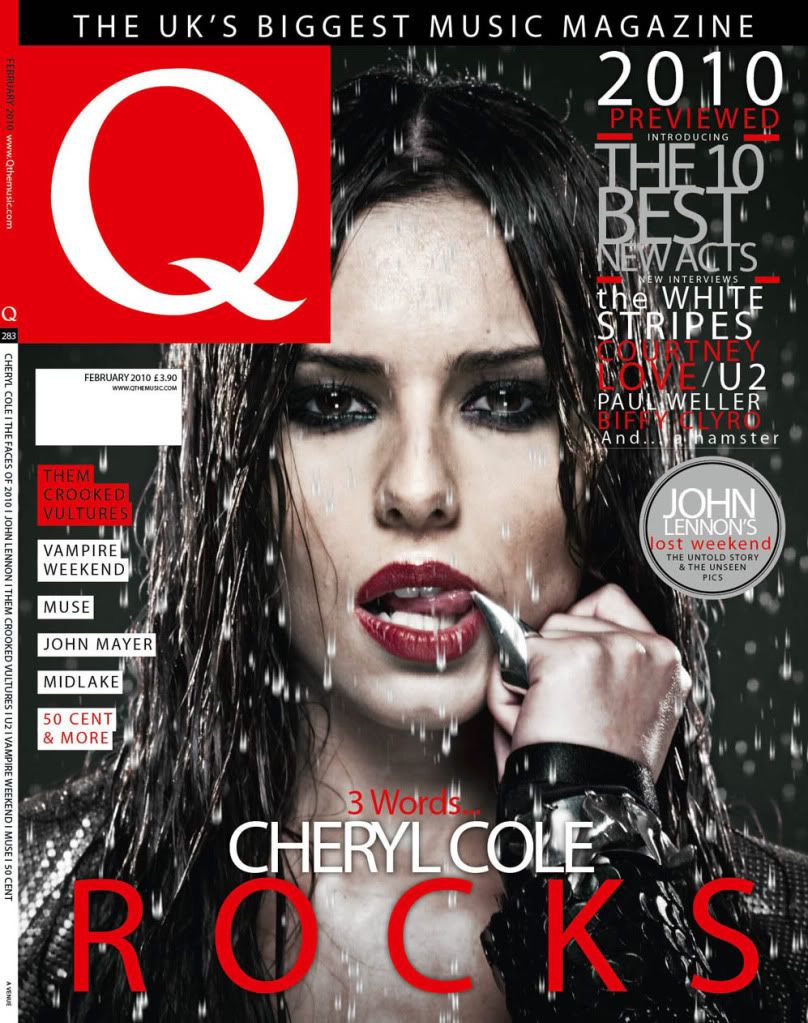
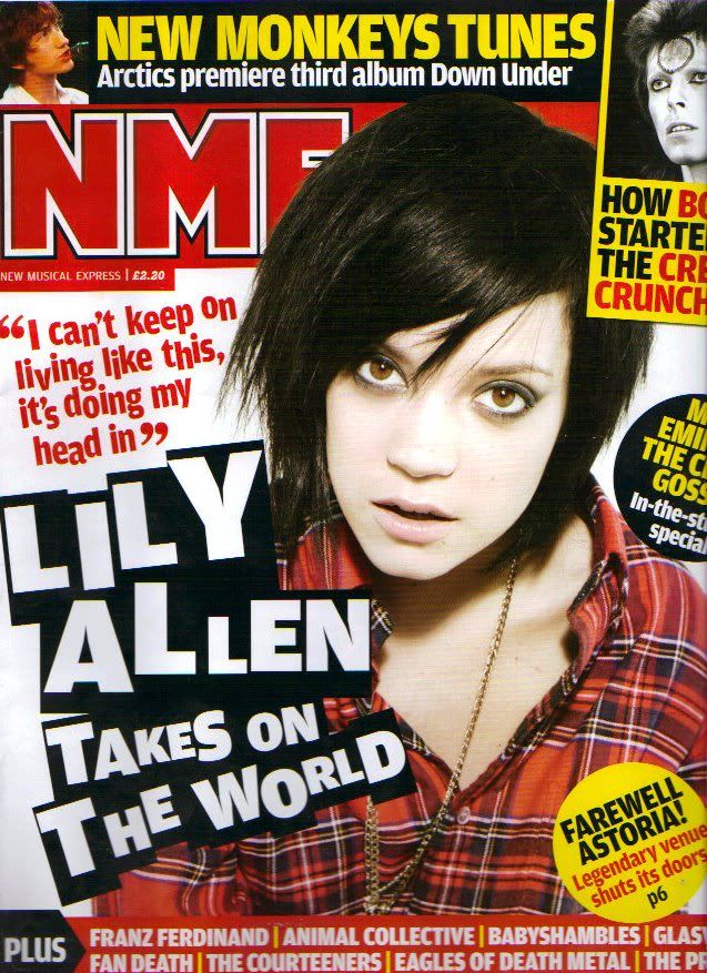 Q's cover is much more 'slick' than NME which is styled in a very young, rebellious way, but Q remains edgy and different from other publications through it's colour scheme and photography. These factors create a different image of Cheryl Cole, who is usually represented as a 'pop princess' , through the dark colouring and contrast with red, creating a dramatic effect which is supported by the uncharacterist photo - encouraging the audience to buy this issue as they may think they will see a 'darker side' to Cole or read about her in a different light. Both magazines feature a red colour scheme which is intergrated into the photo of the artist, suggesting that the music or attitude towards life is intense, high-energy and passionate and that this is reflected in the artists. If Q has 'slick' styling, NME is rough; possibly to attract a younger audience or to reflect the more alternative genre of music. The typography on each cover is bold, but the 'paper clipping' font on NME's cover, and the angled text, suggest sponteneity, re-affirming the 'edgy' attitude of the publication.
Double page spreads:
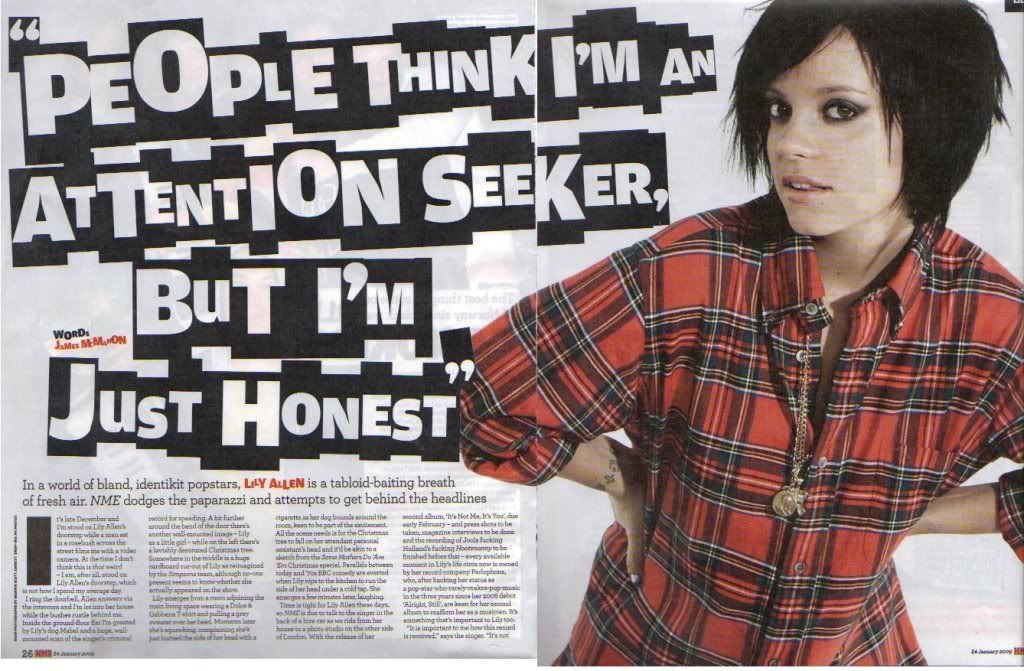
 In terms of content, I would rather my double page spread be like the Kerrang! example because it contains more text and information. I resolved to include a lot of information in my editorial to be able to explore ideas about the background and inspirations of the artist and how this influenced their music because my questionnaire showed that this is important to the audience. The length of the NME editorial wouldn't allow me to do this without it seeming rushed or not flowing very well. However, in terms of styling, I prefer NME. Although each represent their respective genres effectively, I think that the NME spread looks more professional and is impactful in its simplicity. Like the front covers, the two publications use a red colour scheme. The NME spread is a continuation of the front cover's styling, creating continuity. This is something I should consider when creating my own DPS and front cover as it will make my magazine look more professional and have a clear link between the cover article and the feature on the spread. Although I want to include more than one photo on my double page spread, I think that the amount of images used in the Kerrang feature creates a bit of a cluttered look. However, the way the bar running across the page is edited around the photo creates an impression that the artists are coming out of the page, emphasising the larger-than-life attitude of the magazine as well as creating a cleaner, professional effect. The dark colour scheme with the contrasting red and purple signposts the genre as dramatic, dark, intense, powerful or rebellious, as does the clothing of the band, suggesting that they also have these qualities and creating a classic 'rock star' image for them. In contrast, Lily Allen's styling in the NME DPS is very everyday, almost ordinary, suggesting she is down-to-earth and 'one of the people.' When creating my double page spread and styling my model, I need to consider whether I want to create an artist that is relateable or someone that the audience can idolise as the extreme, unreal image they use.
Contents pages:

As with the front covers, Q's cover is much 'cleaner' than the stundent's, Pure Scream, which uses a much messier style to appeal to the younger audience and represent its genre focus. I feel that there is too much writing on the Q contents, and the additional information isn't necessary in some places. Both contents pages feature large, relevant images to break up the text so I shall make sure to include this in my own work. Pure Scream uses the same manipulation technique as Kerrang!, in that the text is edited around the photo, which overlaps in some places to create the same impression - the music is so big and extreme, it's coming out of the page. In contrast, the Q contents is quite boring but the consistent font and colour scheme create a standarised style, as if it is the same each month, meaning that it would be easily recognisable to readers because it is familiar. An issue with the Pure Scream contents is that, although the layout may be the same, the central image would need to be changed to keep it relevant to the features. This could cause problems in the colour scheme if the photo's colours mask the text at all. I also want to include an editor's letter to create a more personal feel to my magazine, which neither of these examples include, which could cause problems with my layout.
In my own work:
Out of these examples, NME is the closest to the genre I am planning to focus on, which is shown in the language. The graphology is simplistic but creates an alternative style, a balance I want to create in my own work to make my magazine seem professional and individual. The pull quote used as the title in NME's DPS is effective in drawing the reader's interested and I am planning on using it on my front cover. In my opinion, my target audience wouldn't be interested in the prestige of the magazine, so I will not be including puffs like the Q front cover ("The UK's Biggest Music Magazine").
From this research, I have noticed typical conventions of this genre including statement fonts; dark colours conrasted with bright, especially red; the model having eye-contact with the reader; label-like block colouring for subheadings and headings (eg. NME's circular 'stickers', Q's artist coverlines and Kerrang's "I was tripping balls" header); intense colouring and imagery and angled text and photos. All of these features create the attitude of the magazine and I plan to include some to reflect the values of my own publication.
No comments:
Post a Comment