Saturday 16 October 2010

Preliminary: First Cover/Contents Mock-up

Using the plans I have created, images [here] and [here] I have created a rough guide to how I would like the magazine to look.
So far, I have decided on the fonts (Lucida Sans and Lucida Bright) and the layout. I am still to decide on the cover image and some of the front cover text and finalise the colour scheme but I am happy enough with what I've created to use it as an example.
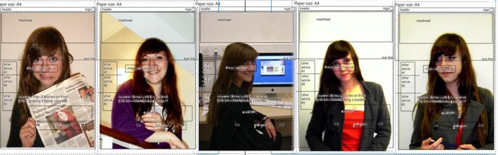
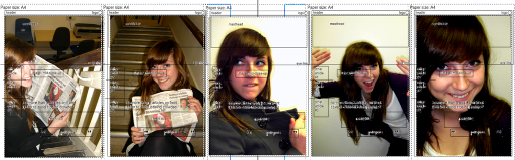
Here is a print-screen of the mock-up I have created:
Layout
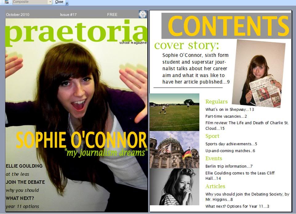
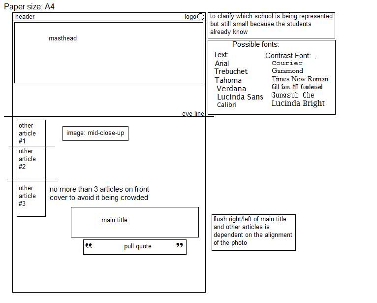
I used my plans for the layout but had to alter them slightly to fit with certain things.
For the front cover, depending on the image, the position of the main title, pull quote and coverlines changes. Here, the coverlines have been moved downwards but with other photos it is flush right and in the top corner.
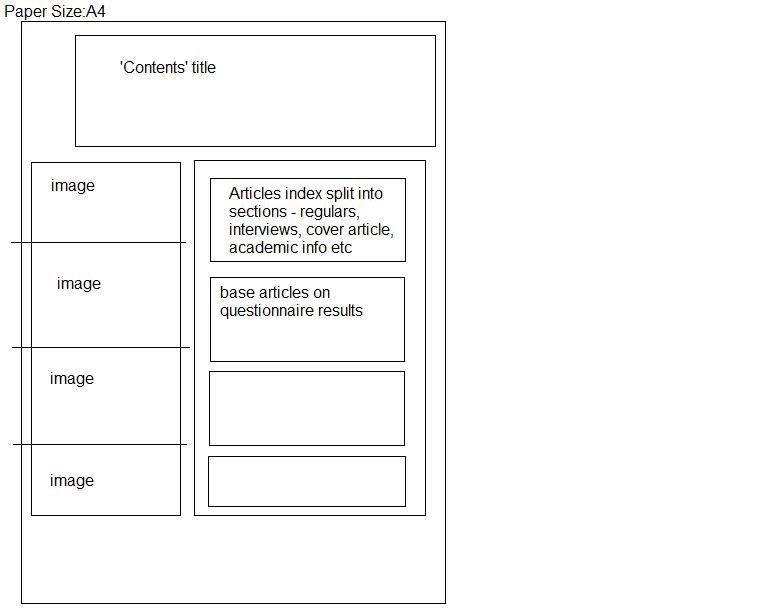
I had to add an extra section to the contents page because what I had originally planned made the page look bare and sparse. I added extra information about the main article but kept the rest of the layout as I had planned.
Mock-up with guidelines:
In this print-screen, you can see where I have changed the layout and what I have kept the same as I planned.

Colour Scheme
One of my main aims concerning the house style was that the font would be quite conservative and traditional, reflecting the school's academia, but the colour scheme would be bright and 'young' so the audience would not be bored looking at the page. Hopefully, I have achieved this.
The current colour scheme is green, yellow, greys and black/white, which I like because it is vibrant, which connotes energy and excitement to life at school. Alternatives I was considering were varying blues and greens, like the school colours and dark pink and teal to appeal to the audience.
Previews of the possible colour schemes:
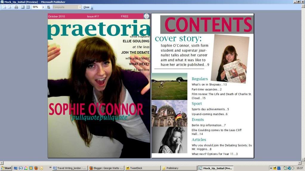
Images
The images shown in these previews are not final - especially on the contents page. They are images I quickly found to suit the articles featured and are only there as a guide. For one, I need to check the rules to see whether the student must take every photo featured themselves, because the photo of Ellie Goulding is only from Google. The other photos are my own, but not taken for the purpose of the magazine so I am not sure whether the images I have used will be acceptable. I will be checking this with my teacher.
Other
I haven't decided on the pull quote text. It was 'my journalism dream' temporarily but I thought it was too cheesey and a bit pretentious for a school magazine.

Preliminary: Initial Contents Page Ideas

As with the front cover, I created a basic guide for what I want my contents page to be like on the computer.
I thought I should upload it because I left it completely out of the previous post and it is still a part of my task.
I plan to split the articles into sections by topic (sport, regulars, articles etc) and base the names of the articles on the questionnaire results. I also will add more photos because a) it is a requirement that we use at least 3 and b) to liven up the page and the back up the articles being mentioned. I will use the same colour scheme and fonts as the front cover into this page to to create continuity and therefore make it look more professional.

From this and the front cover plan, I can begin to create my front cover in DTP.

Tuesday 12 October 2010

Preliminary: Initial Front Cover Ideas

Planning my front cover, I have taken into consideration the results of my questionnaire.
From the data I collected, I know for definite that:
  • The magazine will be aimed at older students (Yr10+) and will discuss both relevant social issues and academic matters
  • The front cover image will not be an overly-formal photo, like a school picture, but more informal and therefore welcoming and engaging to the reader.
  • Content should include information about courses and jobs; listings of local events; students opinions about the school and social issues through interviews and pupil-written articles
From this, I think that the chief article, the one with greatest prominence on the front cover and relating to the front cover photo, should be about an article written by a budding journalist within the school (who just so happens to be my model from the practice photo shoot and the only one of my friends willing to pose) about her career aim.
I took some more photographs for this cover idea, but as it is the same model, I may go back to my initial photos. I tried to make the photos informal and more personal to the reader, but still incorporating the studious nature of the article. I don't think this came across very well but when I create the cover, I'll test them out and see if they're effective.
New photos (yet to be edited or manipulated):


For the other headings on the page, I want to have a range of social and academic articles so I have chosen from the most popular results in the questionnaire. Graphs: [here] and [here]
 The options with the highest results were: tips on finding a job/choosing the right course for you; local event listings and relevant reading material for courses - I will chose three of these as stories for the front cover and try to create short, straight to the point titles for them so that their headings do not clog up the front cover.
Other things I have considered:
  •  The masthead of the magazine will naturally be the biggest text on the front cover and will give a clear idea of the target audience of the magazine and its purpose
  • I was thinking of including a header to the magazine - only a thin strip of text, nothing too big - with some information about the magazine (possibly date, issue number?) and the school logo just to clarify the school the magazine is representing
  • In terms of fonts, I think that they should not be too unbearably 'down with the kids' as the magazine is aimed at the upper school, and this will not attract them as it would the lower school. Personally, I also think it looks unprofessional to have fonts like Comic Sans on a magazine cover. I will use a sans-serif font like Arial, Verdana or Trebuchet for the main text as it will be easy to read and a contrasting font such as Times New Roman or Courier for titles or the masthead, as these will be larger so will be easy to read even if a serif font is used. For the masthead, I may use a one-off font (from the internet?) but it wouldn't match up with the rest of the house-style so I'd have to pick it carefully for it to be effective.
  • As I will be using very everyday fonts, I plan to make the magazine 'young' through the colour scheme. I am going to play about with different colours in DTP to see which go best with the front cover photo (the top result from the questionnaire about colour scheme was to alter it to incorporate colours from the photo) and overall style of the magazine
My initial sketches are yet to scanned, but here are some plans I have made on the computer (click to view larger):

With this plan, I can see which photos look good on the cover and how I would need to reposition any coverlines by pasting the image over the photo in DTP. It's only a rough guide, but it gives me the general idea what the cover would look like with that photo.

Wednesday 6 October 2010

Preliminary: Photo Manipulation

From the photoshoot, I chose two photos to manipulate to represent the aims of my school magazine.

The first photo I chose was a long shot:


With this image, I only made basic tweaks to improve it. I cropped the photo to bring more focus to the model and edited her skin tone so it was less yellow. I then lightened the entire photo but was not successful in making it as bright as I would have liked but this is due to errors in my photography rather than anything else. The way I cropped this photo was to ‘frame’ the model with the beams and walls around her. I also tried to brighten the light around her to create the illusion of stage lighting – connoting that the students of the school take ‘centre-stage.’ I tried to keep as many blue and green tones in the photo as possible because these are the school colours and incorporating them in the photo creates a sense of school pride and unity as well as showing the reader which school it is advertising. Unfortunately, neither of these effects are clear, meaning that the way they would influence the reader is lessened.
 

The second picture I edited was a mid-shot:

For this photo, I thought I’d take an entirely different approach. With the writing on the model’s hand, I imagined that this could be the cover to an issue of the school magazine focusing on the art or graphics department so wanted to show this through the editing. As with the previous photo I firstly created a ‘spotlight’ effect around the model to increase emphasis, however I tried to centre it on the hand to highlight the ‘FSG’ text - making it clear exactly which school the magazine is for. I then adjusted the brightness and contrast levels ready for editing. I originally wanted to create a sketchy/painted effect but it didn’t look good because it wasn’t clear what I was trying to do and just made the photo look bad quality. I then opted for a ‘poster’ effect which looked better, but was too dark. I then adjusted the brightness and contrast levels to lighten the photo and tinted it in white and pink. I chose these colours as apposed to the school colours because green and blue, even when combined with white darkened the photo again and didn’t look as good. In the end, I chose pink because, after all, the magazine is aimed at girls attending the school.

Overall, I think that the editing of the photos was a good exercise because it can add to the meaning of the photo and make it more professional, and I will be considering how best to edit my photos for when I create the actual magazine cover.

Tuesday 28 September 2010

Preliminary: Questionnaire Results

My finished questionaire that I used for research was composed of thirteen questions and contained mostly tick-box options and rating scales for the reader to select. I avoided open-ended questions so I would be able to record the data I have collected.

Here is a print-screen of the questions I asked (click to view larger):

I only sent out the questionnaire to about fifteen friends, but as I didn't get nearly so many replies, I will send any other research out to more people meaning that I can have more data to consider when producing my magazine.


Most people said that they would buy a magazine that discussed social issues and aimed at the upper school, year 10 upwards.
When questioned about what articles concerning social and academic issues they would prefer, want to read about or find useful this is the data I recieved (again, click to enlarge):


Other results I charted were the response to question 11, about school events, and the results of the ratings scales:
These results mean I have a clearer view of what I need to put into my magazine, what should feature on the front cover and what would appeal to my audience.

Monday 27 September 2010

Photoshoot: Practice

To improve our photography skills before taking the photos for the prelimnary or final magazine covers, my freind and I had a practice photoshoot at school.
My camera is pretty bad quality, so I'll be using a different one for the real thing.
I took a variety of close-ups, long-shots, mid-shots and played around with angles for a few.

Here are my (thoroughly narrowed down) final results:


Thursday 16 September 2010

Preliminary: Research

Just about to complete the work I began in class - writing the questions for the questionnaire I am using to conduct audience research.
In order to avoid data that I can't process, I know that I must create closed questions and data-recording tools such as number-rating and tick boxes.

From my questionnaire I want to find out:
  • What type of magazine the students would prefer
  • What kind of content it would have
  • How professional/informal it should be
  • What kind of images students would like on the front cover
  • How the school should be represented in the magazine
  • Which in-school departments should have prominance in the magazine, if any
I would dearly love to create a magazine front cover for a fictional school such as Roundview College (Skins) or Hogwarts to stretch my creative abilities and for the sheer fun of it but it wouldn't be appropriate, which is upsetting. So I'm thinking of producing a magazine for my own school aimed at years 7-11.

I'm thinking of distributing my questionnaire through e-mail, but for friends that I know won't check their inboxes I shall message them over Facebook and make hard copies.