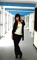
The first photo I chose was a long shot:
 With this image, I only made basic tweaks to improve it. I cropped the photo to bring more focus to the model and edited her skin tone so it was less yellow. I then lightened the entire photo but was not successful in making it as bright as I would have liked but this is due to errors in my photography rather than anything else. The way I cropped this photo was to ‘frame’ the model with the beams and walls around her. I also tried to brighten the light around her to create the illusion of stage lighting – connoting that the students of the school take ‘centre-stage.’ I tried to keep as many blue and green tones in the photo as possible because these are the school colours and incorporating them in the photo creates a sense of school pride and unity as well as showing the reader which school it is advertising. Unfortunately, neither of these effects are clear, meaning that the way they would influence the reader is lessened.
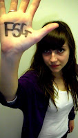
The second picture I edited was a mid-shot:
For this photo, I thought I’d take an entirely different approach. With the writing on the model’s hand, I imagined that this could be the cover to an issue of the school magazine focusing on the art or graphics department so wanted to show this through the editing. As with the previous photo I firstly created a ‘spotlight’ effect around the model to
 increase emphasis, however I tried to centre it on the hand to highlight the ‘FSG’ text - making it clear exactly which school the magazine is for. I then adjusted the brightness and contrast levels ready for editing. I originally wanted to create a sketchy/painted effect but it didn’t look good because it wasn’t clear what I was trying to do and just made the photo look bad quality. I then opted for a ‘poster’ effect which looked better, but was too dark. I then adjusted the brightness and contrast levels to lighten the photo and tinted it in white and pink. I chose these colours as apposed to the school colours because green and blue, even when combined with white darkened the photo again and didn’t look as good. In the end, I chose pink because, after all, the magazine is aimed at girls attending the school.
Overall, I think that the editing of the photos was a good exercise because it can add to the meaning of the photo and make it more professional, and I will be considering how best to edit my photos for when I create the actual magazine cover.

No comments:
Post a Comment