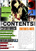
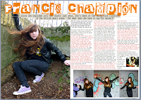
In what ways does your media product use, develop or challenge forms and conventions of real media products?  One of my main aims when starting this project was to create a unique publication, so although I used conventions of real media productions to signpost the genre of the magazine and its attitude, I tried to include more signature elements as well to make it recognisable and to stand out against other magazines. I used the conventional attitude for this genre of music and its publications- to live life loud, to the full, etc - but developed it by adding a passion for the construction of music (instruments, influences, genre-specific styles and techniques) by including articles that focus on this on my contents page. The extreme colours and editing on the front cover also represent the 'hard-core' attitude that many similar magazines have, but as many subdue these colours with blacks and greys, I tried to keep my publication as bright as possible, challenging this conventional style and setting my work apart from other magazines - this is also shown through my use of white in the DPS and contents page.
 One of my main aims when starting this project was to create a unique publication, so although I used conventions of real media productions to signpost the genre of the magazine and its attitude, I tried to include more signature elements as well to make it recognisable and to stand out against other magazines. I used the conventional attitude for this genre of music and its publications- to live life loud, to the full, etc - but developed it by adding a passion for the construction of music (instruments, influences, genre-specific styles and techniques) by including articles that focus on this on my contents page. The extreme colours and editing on the front cover also represent the 'hard-core' attitude that many similar magazines have, but as many subdue these colours with blacks and greys, I tried to keep my publication as bright as possible, challenging this conventional style and setting my work apart from other magazines - this is also shown through my use of white in the DPS and contents page.
How does your media product represent particular social groups? As my model is young, and the artist she represents also, young people are represented as creative and represent the attitudes of the magazine. However, as my magazine is for an alternative style of music, I have tried to make the audience feel they are represented as alternative and individual too. I have done this through the music taste of my artist - older, more obscure music rather than mainstream or well known inspirations - which the audience may know, and which may not be featured in other magazines. The focus on gigs creates an image that the audience will frequently attend them, representing the reader as fun-loving and cultutre-driven. Also, the focus on the production and essence of the music shows the reader as creative in possibly wanting to persue playing instruments themselves or composing songs. My magazine does come across very teen-orientated, which is disappointing because I initially wanted it to be accessable to more people than just a young audience. However, I feel that the focus on the music rather than the artist and live music/gigs may draw additional, possibly older, readers if the magazine gains a reputation for specialising or excelling in this area. On another note, I chose the style of music that my artist sang to be alternative in that she does not sing pop or ballads like many female artists and her music has a much rockier, harder edge that other alternative female artists such as Florence and the Machine. This challenges the regular image of women in music, which I also tried to do with her costuming in the photo shoot. By asking her to wear a t-shirt, jeans etc I represented her as down-to-earth and a regular person, whereas many women in music are shown to be larger-than-life divas or godesses.
What kind of media institution might distribute your media product and why?
I feel that the institutions that publish similar magazines to my own, such as IPC Media, that publishes NME, or the Bauer Media Group that publishes Q and Kerrang! may publish my magazine. However, it is similar to what the sell currently so an independent or lesser-known publisher may more interested - this may not be possible although due to the expense involved in publishing.
Who would be the audience for your media product?
I feel that those most interested in this magazine would be young people (15-25?) with an interest in music greater than what's just in the charts. They may go to university - they will be independent regardless, as this is one of the values of my production - and possibly be interested in the creative arts due to the technical musical focus in some of the articles and alternative design and photography. They may wish to live spontaneously, with lots of fun and no consequences. Despite having a female featured on the cover, my magazine is fairly gender neutral; I have tried not to include factors that appeal only to one gender. My ideal reader would have a wide music knowledge, including mainstream music, obscure and unsigned artists and an appreciation for older or classic music. Their music knowledge would include internet sites where the 'buzz' about artists are such as PureVolume and Hypem and be members of these as well as well-known and established sites for projecting music such as MySpace.
What have you learnt about technologies from the process of constructing this product?
From my original plan for my contents page, I learnt that some things are not possible to do on MS Publisher, which I created most of my work on. I originally wanted to do a diagonal 'slash' across the page with one side being a feature photo about the main article, and the other listing the articles in the magazine - features, regulars etc. However, in practice I found that this was going to be impossible to create without using Photoshop or a similar product, which I'm not very proficient in, due to text boxing and allignment in Publisher. From photo manipulation, I improved my skills in Photoshop, but they are still basic as many of the things I need to learn from it come from frequent use, and I am not experienced enough with the programme to use it at ease. However, manipulating photos meant that I learnt how to use the effects in this programme and Picasa and, after manipulation, how to decrease the size of the finished file. For signature fonts, I used websites such as dafont.com to find them, so I learnt a lot about downloading and installing specific typography.
Looking back at your preliminary task, what do you feel you have learnt in the progression from it to the full product?
I feel that my preliminary was quite strong, because I struggled slightly with the design of the music magazine more, whereas the preliminary was always very clear in what the style should be. I think this may have been because the context of the preliminary was very clear and specific and the music magazine had lots of scope for a range of styles. From this, I learnt to be more decisive as, although I am pleased with the final product, I feel that I spent too long dithering over the design of my magazine and changing it too often resulting in a different style that I had originally intended and myself occasionally losing sight of why I was using the design in this way because I wanted it to look pretty. It is difficult to compare my prelimary and main production as they are so different in context and readership, but I feel that my music magazine was more appropriate to the task set than my preliminary, which included irelevant things to the school. During this project, I have learnt more about how to use and apply skills on various computer programmes, and how to source relevant information from the internet.


